Web Design
Path@Penn
︎ Click to View Prototype
︎Path@Penn is Penn’s student course registration portal. I have identified Path@Penn users’ pain points through surveys and interviews that provided insights into user demographics, goals, and opinions. I redesigned the landing page to increase functionality and increase usability. ︎Area: UI/UX Design, User Research, Figma


Problem
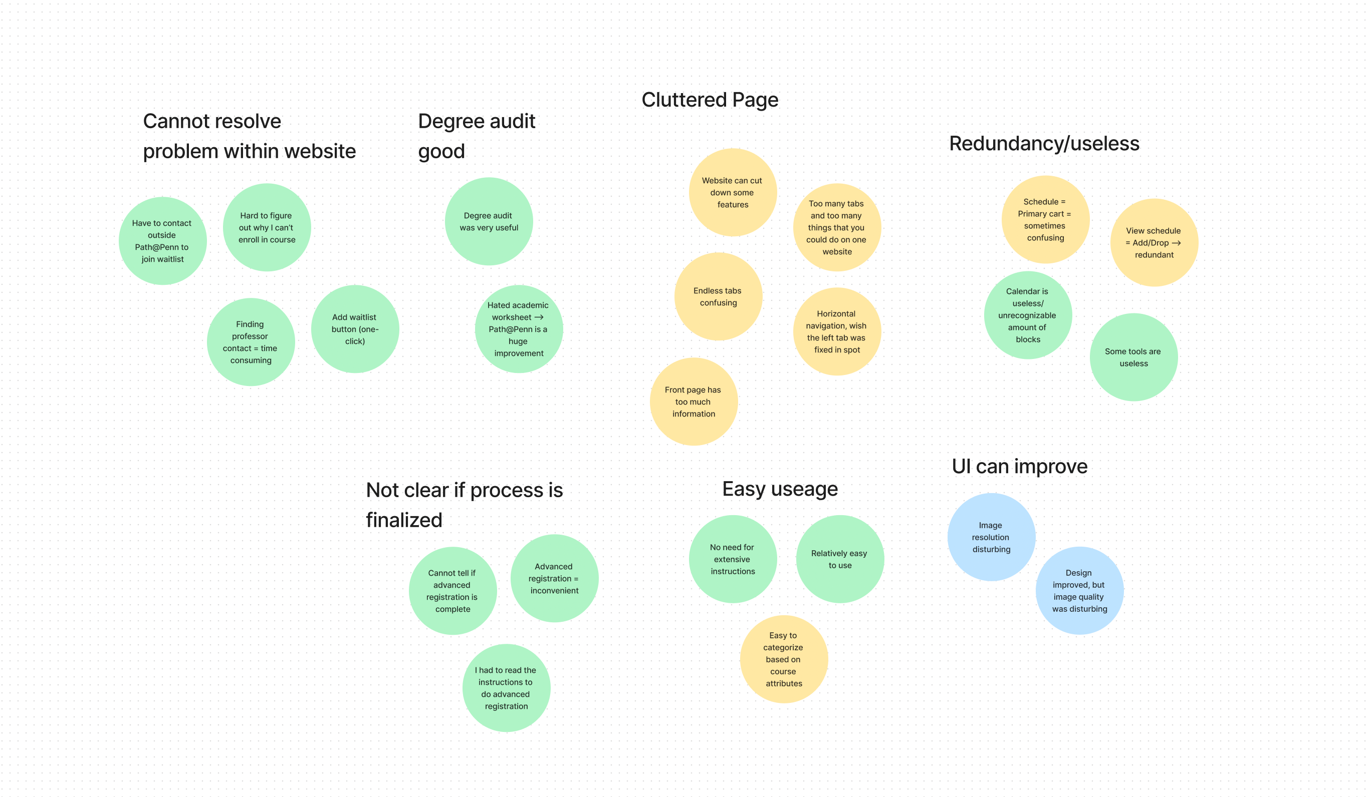
Path@Penn is Penn’s student course registration portal. The first step in identifying the problem was to write a user interview discussion guide. The primary users of Path@Penn are undergraduate and graduate students, administrators, and faculty. While conducting user research that included three in-depth interviews and surveys, I narrowed down the current pain points about Path@Penn. Using affinity diagramming in Figjam, I have synthesized the user’s interview data:


Referring to the research above, I have created six insight statements and five “How Might We” statements. The interviews served as milestones to collect external feedback on the pain points of Path@Penn. From the interviews, a common recurring theme commented on the confusing functionality and usability. The interviewees also repeatedly cited aspects of personalization. The remaining positive feedback on Path@Penn was primarily on the improved UI compared to Penn InTouch (Penn’s former course registration portal). To further understand the pain points of path@Penn, I have conducted a heuristic analysis of Path@Penn.

Low-Fidelity UI Wireframes
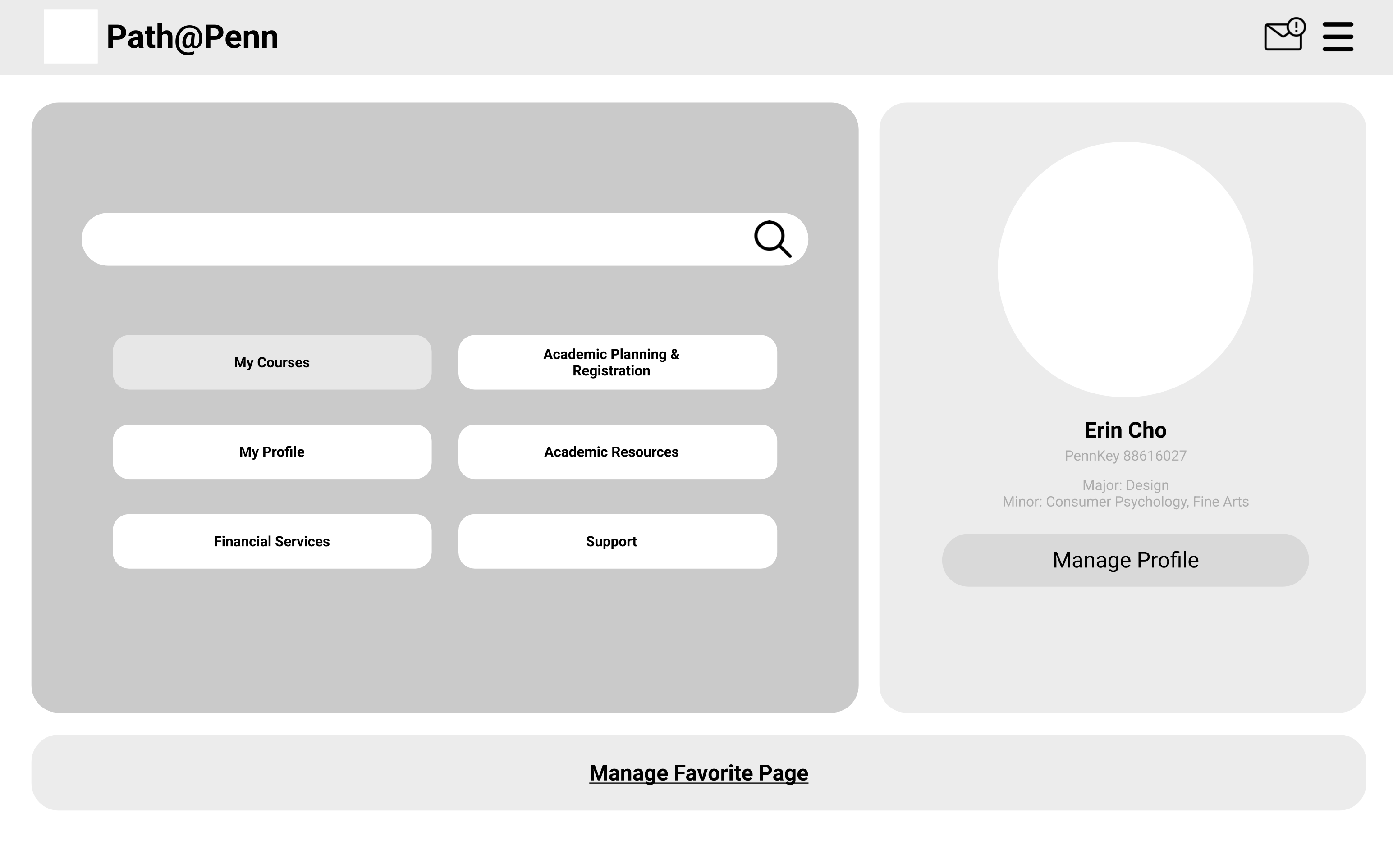
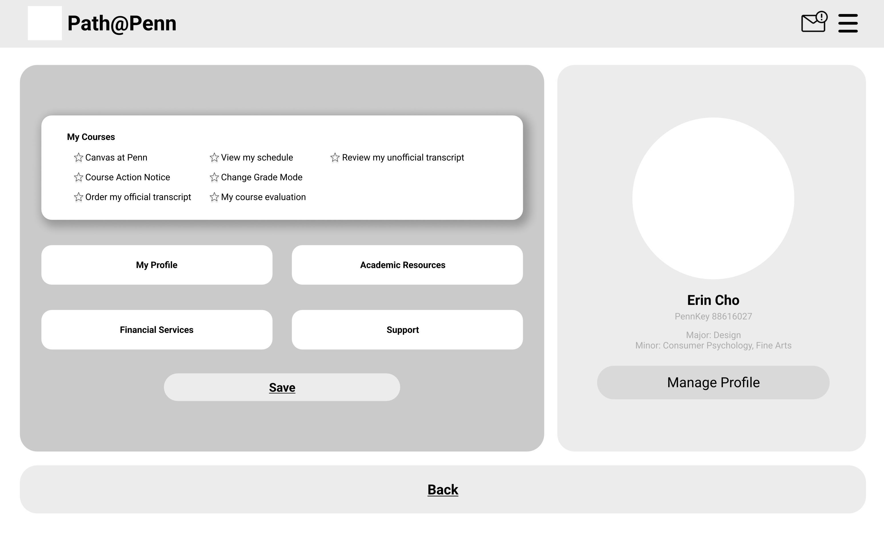
Based off the heuristic analysis and user interviews, I have interated two low-fidelity UI wireframes. In creating the wireframes, I chose one of the “How might we” statements from above to tackle:
︎“How might we choose and cut down tools that the users do not use? How can we simplify Path@Penn and maximize usability?”


Simplicity
During the user research, many interviewees told me that many tools are redundant and some tools they never use. For instance, the “View Schedule” and the “Add/Drop courses” had the same function. However, I acknowledged that the designers should not assume what tools to cut down without numeric data. Thus, the solution I came up with was to provide personalization, where users could choose which functions they would like to have on the top of the landing page. By creating a hierarchy of the most used tools, the website would provide a more straight-forward view.
Improved UI
The interviewees also commented on the general UI of the website. They agreed that the design improved compared to the former course registration portal, but they were not pleased about the image and its quality. Instead of having a image, I decided to leave the background as simple as possible because some people also commented on the cluttered landing page. By visually grouping the information, Path@Penn would become easier to digest on first sight.
Prototype
︎ Click to View Prototype
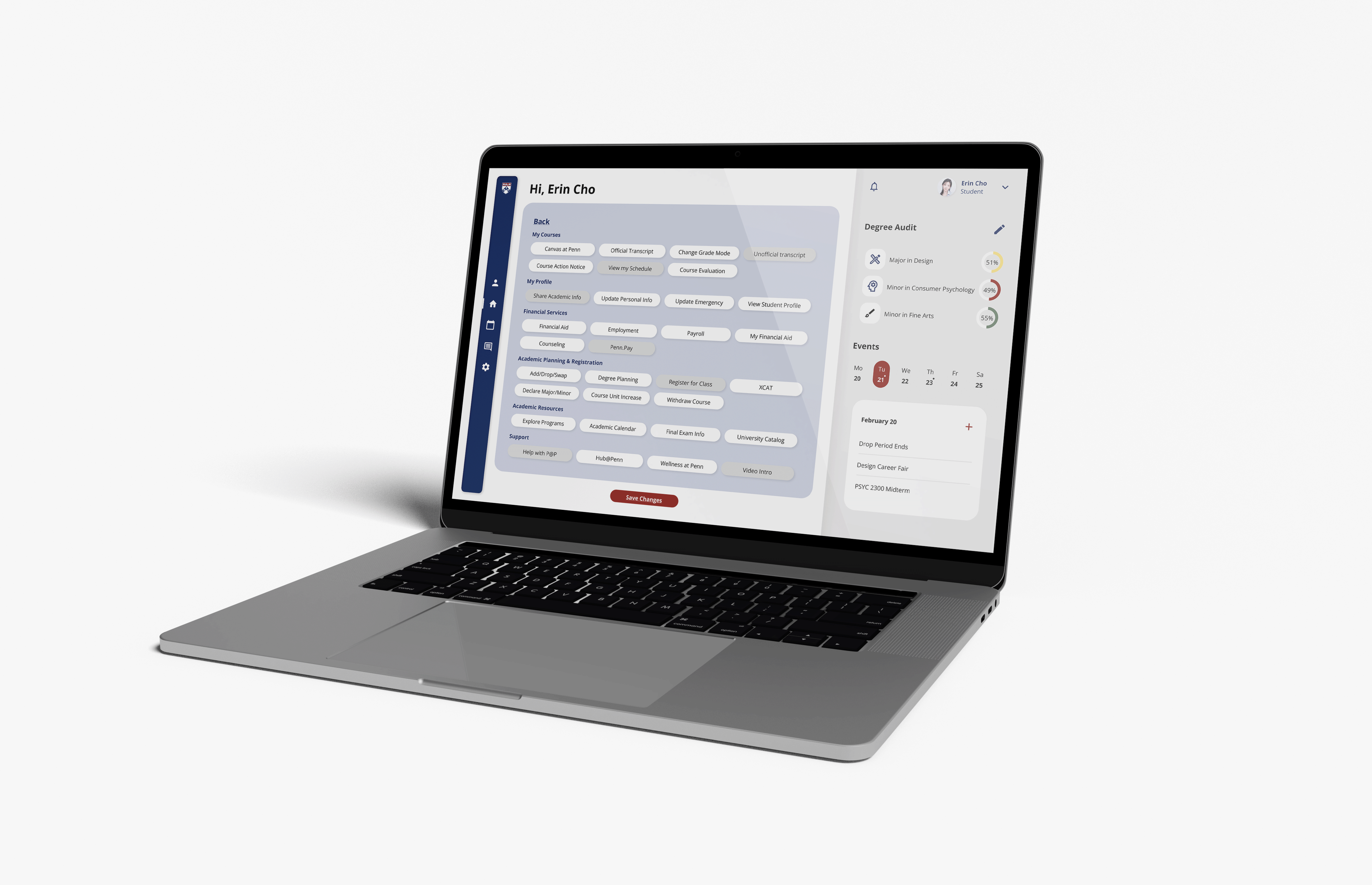
With the prototype, I focused on the general UI, simplicity and personalization. I tried to recreate a modern and simple typeface, and aimed to cut down as much visual language. With round corners and sans-serif typeface, I decided to give a more friendly design.
︎Did not assume what the users would like to “cut down,” and provided an option to personalize functions instead
︎Made widgets on the right also customizable (e.g. calendar, degree audit, events, messages)
︎Aimed to clearly categorize different sections by dividing the page in three main different sections: favorites, general tools, and widgets
︎Focused on simplifying UI and easy use for the users


